Procter Cast Stone launches improved website

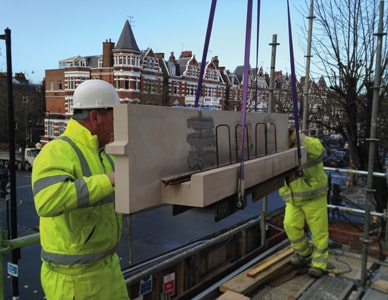
The first thing visitors will notice is improved use of the screen space, particularly when viewing the website on a widescreen display; a new slideshow of large photographs on the Home page illustrates cast stone products, completed projects, manufacturing and site surveys.
Continuing with the theme of enriched graphics, the website’s gallery section has been redesigned, as have the individual product pages. Throughout the site, the pages benefit from a fresh, clearer layout that makes it easier for visitors to find what they need. In addition, the product pages have gained helpful links to downloads on the left-hand side, and there are new illustrated links to related products at the bottom.
Page design throughout the site is now more consistent, yet the proven menu structures are unaltered. One enhancement to the navigation is the inclusion of a small menu at the side of the product pages so visitors can easily jump between related products.
Explore the new website or contact Procter Cast Stone to discuss specific projects by means of the Live Chat facility on the website, email info@proctercaststone.co.uk or telephone us.


